Mars can change colour without moving a grain of dust. Follow the measurements, the processing and the captions behind our familiar worlds.
Lens · 12 September 2026 · Evidence checked 12 September 2026 · 16 minute read
Different products, different promises
Space images answer different questions. Some approximate human vision; others map invisible wavelengths, terrain or composition. The decisive evidence is the named image's instrument and processing, not whether its colours look dramatic. Many original captions disclose the difference; how often that context disappears remains unmeasured.
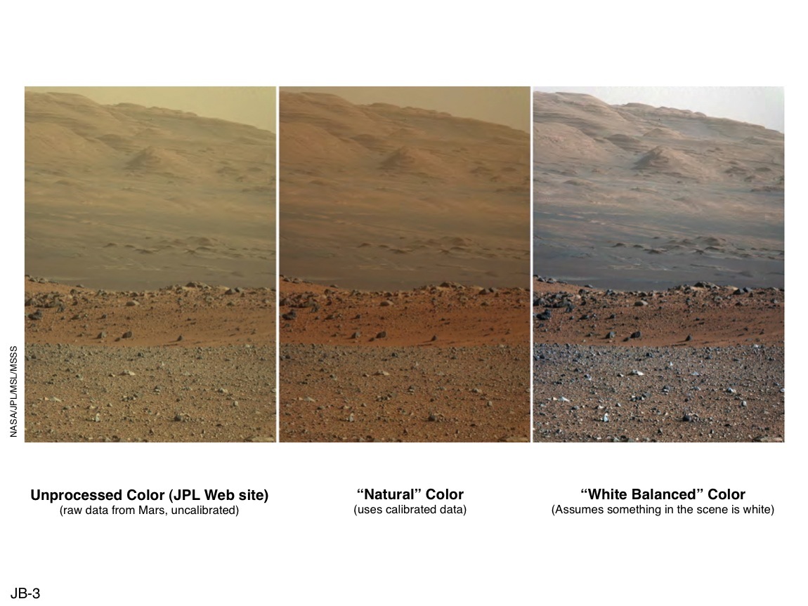
Why Lens says this →NASA/JPL-Caltech/MSSS · PIA16800. Curiosity's published raw, natural-colour and white-balanced comparison. Read each panel label; these are processing versions of the same terrain.What people heard
An illustrative assumption: a familiar planet picture shows exactly what a person would see. Lens has not measured how widely this is believed.
The Solar System you were shown
Choose how to read this
Read, listen or follow the question.
The facts do not change. Each view uses the same published sources and leaves the same questions open.
◫Different viewsSee what each perspective notices—and may miss.
See through another Lens
Which view do you want to understand first?
Each view notices something useful. None is allowed to stand in for the complete evidence.
The planetary scientist
Enhanced and non-visible images make otherwise hidden evidence legible.
What this view explainsWhy the processing is necessary and useful.
What it may missA reader may interpret an isolated image as a visible-light photograph.
Start with one patch of Mars
Three pictures show the same ground. In one, the light looks unfamiliar. In another, the rocks seem more like rocks you might pick up on Earth. Nothing on Mars moved between these versions. The processing changed.
In 2013, NASA published a Curiosity Mastcam scene in raw, natural-colour and white-balanced treatments. The underlying observation was made on 23 August 2012. The middle treatment estimates the scene under Martian illumination. The white-balanced treatment helps geologists compare rocks under more familiar illumination.
The distinction was in the caption. The question for a reader is whether it stayed attached to the picture. A white-balanced Mars image can be useful science and still be a poor answer to 'what colour would the sky look if I stood there?'
A camera does not transmit vision directly. Its detector responds to light through particular filters. Measurements are corrected for the instrument, combined, registered and mapped into the red, green and blue channels of a display. Some observations use wavelengths no human eye can detect.
Calibration is not the opposite of honesty. It is often what makes the measurements interpretable. A raw detector image may contain instrumental effects or an unhelpful balance between channels. A calibrated human-colour estimate can be closer to the intended viewing condition.
The essential question is what the treatment was designed to preserve. Human-visible appearance, material differences, temperature-sensitive structures and terrain elevation are different targets. An excellent picture for one job can mislead when quietly recruited for another.
Mars has a history of cameras, not one colour setting
Viking's first colour surface scene came from three filtered scans on 21 July 1976. The archive describes the camera and a reference target. Its modern archive release date is not the date the lander saw the scene. That distinction matters when a migrated web page becomes someone's historical evidence.
There was also a real early colour error. NASA's later chronology of 1976 records contemporary reporting that an initial Viking reconstruction showed a blue sky after incorrect weighting of the colour filters; a correction would make it pinker. The chronology cites the Washington Star of 22 July. That is evidence of a specific reported reconstruction error, not proof that a later blue sunset or every white-balanced image is wrong. The historical account and the modern archive caption have different evidential jobs.
Pathfinder's sunset observations show the sky varying with direction. Spirit's archived Pancam science mosaics distinguish approximate true colour, false colour and anaglyph products. Opportunity's final panorama assembles 354 images made over several weeks in 2018 and offers more than one colour treatment. None is simply one unprocessed click.
Phoenix's trench composite combines observations from different times in its 2008 mission. It is described as approximate true colour. That label addresses appearance; 'composite' also tells you that the whole scene did not occur in one camera exposure.
Perseverance continues the explicit distinction. Its Arbot panorama, observed on 5 April 2026 and released in May, has an enhanced main version and a natural-colour alternative. The 46-image mosaic is a contemporary example of the mission supplying the explanation rather than hiding it.
This history does not support a blanket claim that all Mars pictures were made with the same processing, or that every change in colour is a correction of an earlier error. The individual product is the unit to investigate.
Figure A · Natural-colour version of the 5 April 2026 Mastcam-Z mosaic.
NASA/JPL-Caltech/ASU/MSSS · PIA26753, released 12 May 2026. 46 constituent images. Lens resized these published products without intentional colour adjustment. Original captions and downloads →
Blue near sunset is not an Earth-like blue sky
Martian dust changes how sunlight is scattered. Near the setting Sun, blue light can be concentrated in a way that reverses a familiar Earth expectation. Other parts of the sky can look yellowish or orange. Direction matters.
A frame showing a blue region near sunset does not establish a blue daytime dome. A dusty sky is not identical every day. The observer's location, the Sun's angle, atmospheric conditions and the camera's treatment belong in the explanation before anyone turns a scene into a universal colour for Mars.
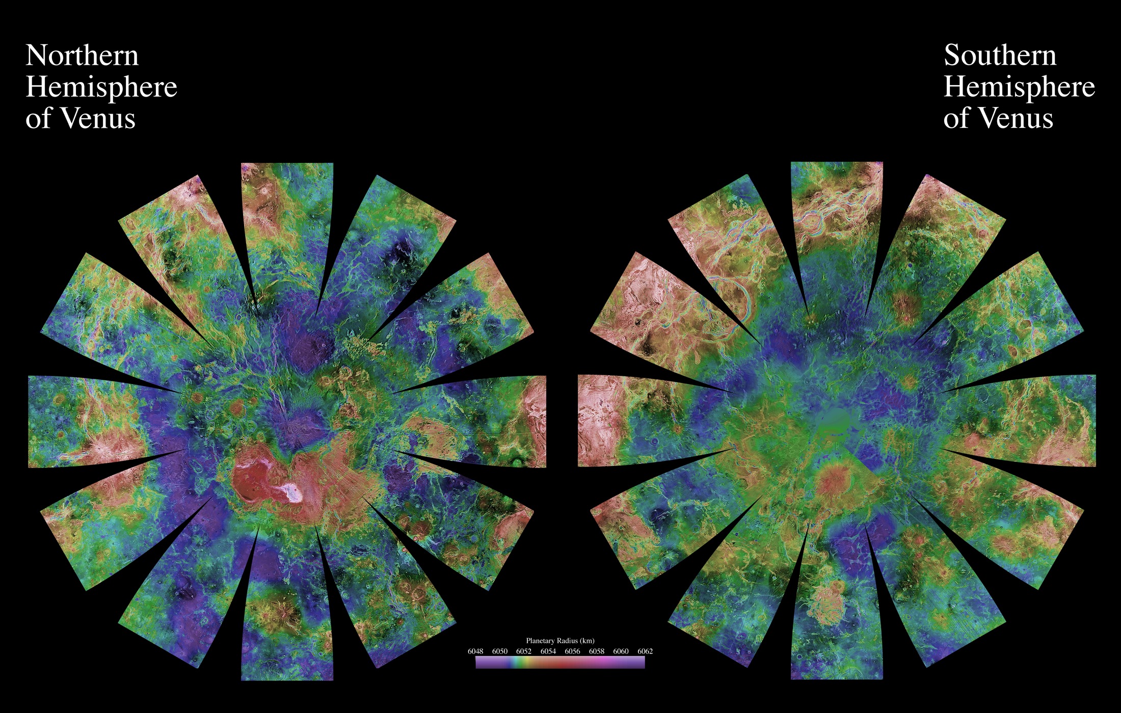
The thick clouds of Venus create a different problem. Magellan used radar to study the surface. Radar measurements can be turned into a terrain mosaic, while colour encodes elevation or a visualization supplies simulated surface shading.
These products are not all interchangeable. The hemispherical globes in PIA03151 use colour coded elevation. Other Magellan products emphasize slopes or different terrain properties. It would be as careless to declare that every orange Venus globe uses the same height scale as to declare that all of them are natural-colour photographs.
Venera landers returned actual local surface views. Those are precious observations from particular landing sites, not a global visible-colour map. The full Venera catalogue page could not be retrieved for this investigation; Lens is not presenting a new reconstruction or claiming a precise global human-view palette from it.
The honest comparison is between kinds of evidence: cloud-top optical images, radar surface maps, observations through infrared windows and local lander panoramas. They make different parts of Venus knowable. One does not become the other's missing photograph.
There is an important exception to a simple 'the clouds block all visible surface information' account. Parker Solar Probe's WISPR observations in 2020 and 2021 detected the hot nightside surface glowing through the clouds at the red edge of visible light and into the near infrared. NASA describes an instrument range of 470–800 nanometres. This reveals surface structure under particular conditions; it does not turn a radar globe into a photograph or supply a global RGB surface-colour map.
Pluto: two useful pictures, two different promises
New Horizons returned a world with remarkable variation. A widely circulated enhanced product combines blue, red and infrared MVIC observations from the July 2015 encounter. Its colours draw out distinctions across the surface.
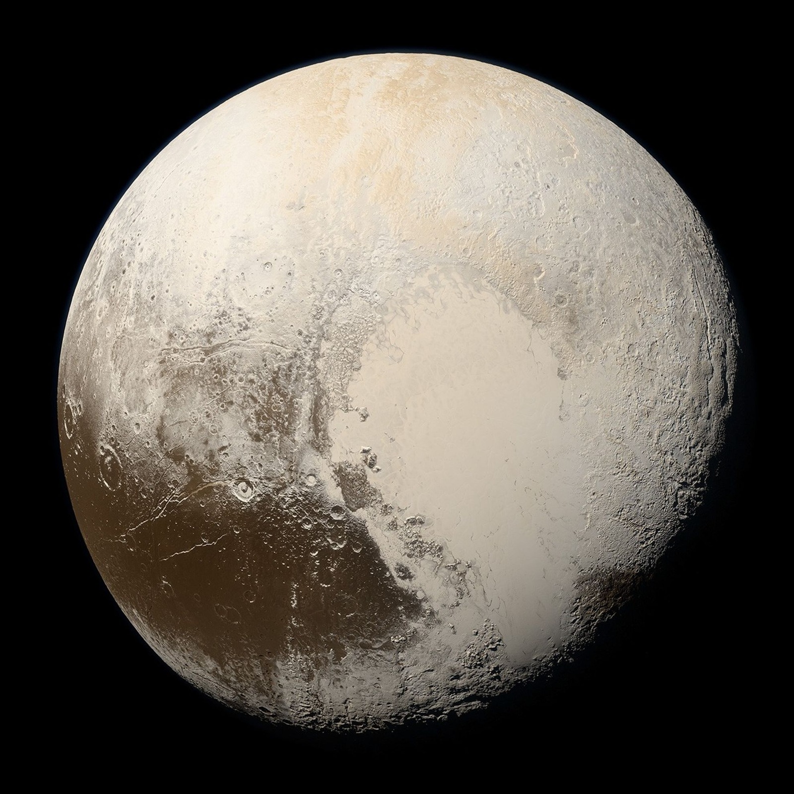
In 2018 the mission published a refined natural-colour rendering from an MVIC scan, explicitly intended to approximate human-visible appearance. The brighter diagnostic palette and the calibrated approximation are not competing claims that only one Pluto exists.
Lens shows the release labels with both images. These products share the encounter, but a frame-for-frame match has not been established here. Their comparison demonstrates different processing purposes; it should not be sold as a laboratory experiment in which every other variable was held fixed.
Nor has Lens counted how often either version appeared in classrooms, news stories or posters. It is possible to document the palette difference without pretending to have measured which image most people carry in their heads.
2018 release · MVIC calibrated human-colour approximation, based on a July 2015 scan.
NASA/JHUAPL/SwRI; natural processing Alex Parker. Same encounter; identical input frames have not been established here. Lens resized these published products without intentional colour adjustment. Original captions and downloads →
Neptune's famous blue needed a better comparison
A 2024 study led by Patrick Irwin revisited Uranus and Neptune using spectral observations and spacecraft images. With those constraints, the two planets emerge much closer in colour: both greenish blue, with Neptune slightly bluer.
The deeply blue Neptune familiar from some Voyager presentations had been enhanced more strongly. The revised comparison is about how measurements were displayed. It does not mean that Neptune physically changed its atmosphere in January 2024.
The research team's public account says enhancement had been explained but that the distinction became less clear over time. That is a meaningful account from the people studying the problem. It is not a measured reconstruction of every journey from an agency archive through a publisher to a reader.
Uranus also changes with season. Polar haze and methane's effect on reflected light matter. Even a well-calibrated picture should not be turned into a timeless paint chip for an entire planet.
The Sun's coloured scientific portraits often use ultraviolet or extreme ultraviolet channels. NASA's Solar Dynamics Observatory uses display colours to make those measurements legible. A channel at 171 angstroms does not mean the Sun emits that radiation as visible gold. It is outside human vision.
The combined visible light of the photosphere is approximately white before Earth's atmosphere changes the view. That statement does not turn a narrow-band solar image into a useless picture. The image may reveal structures that ordinary eyesight cannot distinguish.
Earth's 2002 Blue Marble is assembled from observations collected at different times, with land, ocean, cloud, ice and relief inputs. It is not one exposure of one instant. That explains a particular product; it does not prove that every whole-Earth photograph is assembled the same way.
Galileo's false-colour Moon mosaic makes compositional differences conspicuous. Its vivid palette is not a claim that an ordinary lunar walk would resemble that map. A mineral map is answering a more specific question than a postcard.
Different colours do not always mean different processing
Saturn supplies useful counterevidence. Cassini's comparison of the northern polar region in 2013 and 2017 shows a shift associated with seasonal haze. The subject changed, not just the display treatment.
Io supplies another caution. A Galileo product combining near infrared, green and violet observations is explicitly described as an approximate human view. Using an infrared input does not, on its own, invalidate a carefully calibrated visible-colour estimate. The transfer from measured bands to displayed colours matters.
Jupiter images have a large community of processors, including people making natural-colour approximations and people revealing subtle structures through enhancement. Their individual credits and methods matter. Lens links one natural-colour example rather than reproducing a citizen-processed image carrying a noncommercial licence.
A credible investigation has to preserve these inconvenient cases. 'Everything is fake' makes the same mistake as 'everything is what a person would see': it replaces specific products with a universal story.
Europa's reprocessed globe combines observations from different encounters, corrects scattering and fills gaps with simulated colour drawn from neighbouring terrain. Those are consequential disclosures. They do not mean the whole surface was invented, but they do mean not every displayed colour at every point was independently observed.
Titan's infrared maps are an especially clear category distinction. Ratios between invisible wavelengths are assigned to display colours. Infrared can expose surface information obscured in ordinary visible views by haze. Removing the haze would not make human eyes sensitive to those infrared ratios.
Enceladus has enhanced mosaics combining ultraviolet and infrared information across years of observations. Triton's Voyager caption explicitly identifies missing true blue-band data. Ganymede's natural-colour label establishes its intended purpose, while the Callisto caption checked here does not supply a complete recipe.
The object register below keeps those differences open. Where the processing description is incomplete, Lens leaves the exact human-view fidelity unknown instead of choosing a verdict from how colourful the picture looks.
Dawn's rainbow Vesta map uses ratios between filters to expose differences in the surface. Ceres also has enhanced false-colour products. A separate clear-filter grayscale view helps show form and brightness, but is not itself a visible RGB reference.
Rosetta's restrained colour composite of comet 67P combines red, green and blue-region measurements after aligning sequential views. The release explains that brightness contrast was stretched. A dark, low-reflectivity body can therefore be easy to inspect on a bright screen.
Later observations found local colour differences around the comet's neck consistent with exposed ice. The early broad description of a fairly uniform dark surface cannot be stretched into a claim that every place, at every time, had identical material.
Comparing different missions adds another layer. A 2024 study cross-calibrated Ryugu and Bennu observations against a common lunar reference because their instruments had used different calibration targets. Hayabusa's AMICA paper likewise describes the corrections needed for Itokawa observations. These are examples of science exposing and reducing measurement uncertainty, not promises that every later web rendering precisely reproduces human vision.
Some familiar corrections are about physics, not pictures
Mercury is closest to the Sun, but Venus is hotter. Mercury can also preserve ice in permanently shadowed polar craters. Distance alone does not settle temperature everywhere.
The Moon's far side is not a permanently dark side. And 'space is silent' needs a setting: vacuum does not carry ordinary sound, while the Martian atmosphere does, and Perseverance has recorded it.
The asteroid belt is not a continuous slalom of nearby rocks. These are useful corrections because each restores a missing condition. They do not establish that audiences universally hold the mistaken version, or that one institution taught it.
Ask which instrument measured the light or other signal. Ask which wavelengths were collected. Ask when and from where the observations were made. Ask what calibration, mapping, compositing or enhancement produced the picture. Finally, ask which question the picture was designed to answer.
An image can be scientifically faithful without simulating eyesight. A human-colour approximation can be useful without being exact. A composite can be informative without recording a single instant. Those are reasons to read the label, not reasons to distrust every image.
The failure to investigate is not colour itself. It is the moment a specific, qualified product becomes an unqualified claim about a world. Keeping the explanation attached lets us retain both the wonder and the knowledge.
These are named examples, not an audit of every image ever released. The original records are linked below each entry.
SunThe familiar gold, red or purple disc
What was measured and processed
SDO AIA separates ultraviolet and extreme ultraviolet channels; visible display colours encode invisible radiation. HMI observes a narrow visible line, not a full RGB portrait.
What a human view would mean
The photosphere's combined visible light is approximately white outside Earth's atmospheric filtering. Looking directly at it is unsafe. A coloured EUV channel cannot predict the colour of a prominence to an unaided eye.
Strong for the stated product; human-view limits retained
MESSENGER's PIA14190 assigns 1000, 750 and 430 nm to RGB. One band is infrared; the deliberately expanded colours discriminate surface differences.
What a human view would mean
A visible observer would not see this particular blue/gold display palette. Illumination, phase and adaptation still matter; this record is not a calibrated full human-view reconstruction.
Strong for the stated product; human-view limits retained
Magellan radar measures the surface through clouds. PIA03151 uses colour coded elevations. Other radar visualizations use slope or simulated shading: not every orange Venus globe uses the same recipe. WISPR also detects faint nightside thermal glow at the red-visible/near-infrared boundary through cloud windows.
What a human view would mean
Venera establishes local surface views. A global visible-colour surface map is not established. Cloud-top optical views, radar maps, infrared windows and local lander panoramas are four different products.
Strong for the stated product; human-view limits retained
The 2002 Blue Marble combines months of MODIS land observations with ocean, cloud, ice and relief inputs. It is assembled, with different input dates.
What a human view would mean
Earth really has blue oceans and white clouds. This product does not show one instant. The existence of a composite does not establish that every whole-Earth picture is a composite.
Strong for the stated product; human-view limits retained
Galileo's PIA00131 combines 53 images in three filters into a deliberately false-colour mineral mosaic. Colour distinctions make geological differences legible.
What a human view would mean
Ordinary visible views are much less chromatically dramatic. Lighting and local geology vary. This three-filter map alone cannot supply an exact observer-matched colour reconstruction.
Strong for the stated product; human-view limits retained
MarsOne rusty planet, several apparently incompatible skies
What was measured and processed
Missions have published calibrated approximations, white balanced scenes, enhanced filter composites and raw frames. The Curiosity comparison holds one scene fixed while changing treatment.
What a human view would mean
An observer sees particular terrain under Martian illumination, not a permanent planet-wide colour swatch. Dust and viewing direction change the sky; blue close to sunset does not establish an Earth-like blue daytime dome.
Strong for the stated product; human-view limits retained
JupiterVivid swirls that seem to change from picture to picture
What was measured and processed
JunoCam data support both approximate natural-colour and enhanced citizen-processed views. PIA22427 identifies an approximation of human appearance. Processing provenance belongs with each contribution.
What a human view would mean
A person would see coloured clouds, but cannot infer the exact saturation of a neighbouring enhanced view from this one. This image is linked rather than reproduced because of its noncommercial licence.
Strong for the stated product; human-view limits retained
PIA21611 compares red/green/blue Cassini images from 2013 and 2017. The mission attributes the shift to seasonal atmospheric haze as the northern summer approached.
What a human view would mean
This is counterevidence to an editing-only explanation. Real conditions changed too. The two products are not a controlled same-scene demonstration of processing alone.
Strong for the stated product; human-view limits retained
The 2024 reanalysis uses spectral constraints with spacecraft imagery. Uranus's appearance also changes seasonally through polar haze and methane absorption effects.
What a human view would mean
The reconstruction is greenish blue, with seasonal variation. A single fixed swatch suppresses time, phase and calibration uncertainty.
Strong for the stated product; human-view limits retained
The 2024 work finds familiar Voyager presentations were enhanced more strongly than Uranus. Rebalancing with spectra makes the two planets much closer in colour.
What a human view would mean
Neptune remains slightly bluer in the reconstruction. This corrects a display comparison; it does not mean Neptune physically changed colour in 2024. The authors' account of caption loss is not a measured census of public misunderstanding.
Strong for the stated product; human-view limits retained
PIA19952 uses MVIC blue, red and infrared in an enhanced display. The 2018 natural-colour release uses refined MVIC calibration from a single July 2015 scan.
What a human view would mean
The calibrated version is an approximation of human-visible colour. The two releases share the encounter; Lens does not assert identical input frames without a frame-level match. Enhanced colour remains useful for comparing terrains.
Strong for the stated product; human-view limits retained
PIA02308 combines near infrared, green and violet Galileo observations and explicitly describes an approximate human view.
What a human view would mean
Io's surface has real strong colour differences. Inclusion of a band outside ordinary visible vision does not, by itself, prove an intended human-colour approximation is invalid: calibration and the transfer to display colour matter.
Strong for the stated product; human-view limits retained
The reprocessed Galileo globe uses 1995 and 1998 observations, corrects scattering and fills some missing areas with simulated colour from nearby terrain. Near infrared, green and violet inputs are used.
What a human view would mean
This is a useful approximate-colour mosaic, not one instantaneous photograph with every pixel independently measured in every colour. The filled gaps deserve a label, not a claim that the entire image was invented.
Strong for the stated product; human-view limits retained
PIA21923 combines 13 years of VIMS observations with infrared band ratios assigned to RGB. The visible comparison shows the atmospheric haze; infrared windows expose different surface information.
What a human view would mean
Removing haze would not make human eyes sensitive to infrared. A band-ratio map is not literally what a person would see with clearer air. Changing wavelength and removing obscuration are separate operations.
Strong for the stated product; human-view limits retained
The 2009 archive release describes 1989 green, violet and ultraviolet measurements. The caption explicitly explains that no true blue-band input was available.
What a human view would mean
The visible approximation is constrained by those missing measurements. Do not turn an acknowledged approximation into an exact human-view reconstruction.
Strong for the stated product; human-view limits retained
PIA15141 maps ratios among 440, 750 and 920 nm filters to RGB. PIA14778 is a separate clear-filter grayscale view.
What a human view would mean
The ratio map exposes composition and the clear-filter image exposes brightness and shape. Neither alone is a full visible RGB reconstruction; a grayscale comparison cannot certify a natural colour palette.
Strong for the stated product; human-view limits retained
Eros and the remaining asteroid boundaryColourful maps, dark rocks and uneven evidence
What was measured and processed
NEAR's Eros release describes subtle colour differences. Other missions need their own calibration records; their results cannot be inferred from Dawn's Vesta recipe.
What a human view would mean
The Eros caption describes subtle colour differences without providing a full display-transfer recipe. The separate Bennu/Ryugu and Itokawa entries add calibration research; an image-by-image audit of every downstream display remains incomplete.
CometsA bright, detailed grey body against black space
What was measured and processed
Rosetta's 67P composite combines 744, 536 and 481 nm observations after registering sequential views. Its brightness contrast is stretched while colour is kept restrained. Later Hapi observations reveal local spectral differences.
What a human view would mean
The surface is very dark in reflected-light terms. A bright screen display is not its reflectivity. 'Dark' also does not specify an astronaut's adapted perception under every viewing condition. The evidence does not establish that all comets have identical colour.
Strong for the stated product; human-view limits retained
Bennu and RyuguTwo dark asteroids whose measured colours need a common reference
What was measured and processed
Hayabusa2 ONC-T and OSIRIS-REx MapCam used different calibration targets. A 2024 cross-calibration study compared their Moon observations with lunar models, revealing a substantial instrument-to-instrument bias before correction.
What a human view would mean
The corrected comparison improves relative reflectance and spectral comparisons. It is not an exact human-view image pair. A difference between two published displays can contain instrumental calibration as well as real surface differences.
Strong for the study's stated calibration result; no new human-colour reconstruction performed
ItokawaA rocky, irregular asteroid in Hayabusa pictures
What was measured and processed
AMICA acquired more than 1,400 multispectral and high-resolution views from August 2005. Its calibration paper describes detector, dark-current, smear and sensitivity corrections, with stars and ground observations supplying references.
What a human view would mean
The published calibration's error estimates describe the instrument; they do not certify every later web image as an eye-matched view. The paper itself identifies scattered light as a remaining limitation in that calibration.
Strong for instrument methods; exact processing of every downstream image is not established
Space images answer different questions. Some approximate human vision; others map invisible wavelengths, terrain or composition. The decisive evidence is the named image's instrument and processing, not whether its colours look dramatic. Many original captions disclose the difference; how often that context disappears remains unmeasured.
Direct record
Mission captions identify raw, calibrated, enhanced, composite and non-visible products.
Lens inference
A purpose label is part of the information needed to interpret an image.
Contrary evidence
Many captions already disclose processing. Io has real colour differences; Saturn's appearance changed with physical conditions.
What we checked
Mission archives, instrument documentation, a primary spectral study and its public explanation. See the object and source registers; Venera retrieval and some small-body image-level audits remain incomplete.
What remains unknown
A measured rate of caption loss across news, textbooks and social platforms
Exact human-view colour error without complete spectra, calibration, display and viewing conditions
A complete image-level audit of every asteroid and comet mission
The full Venera catalogue entry, which could not be retrieved in this review
What would change the answer
New calibrated products or corrections to these mission captions
A reproducible frame-level or spectral analysis that changes a stated comparison
A documented downstream reuse chain or audience study that establishes prevalence
Last checked 12 September 2026. AI-assisted research and writing; original records retained.
How this explanation was prepared
AI-assisted primary-source comparison. Original source links, dates and limits retained in the research dossier. Publisher reviewed and approved this issue on 12 September 2026.
Keep the directly recorded mechanism, the interpretation and the remaining unknowns separately inspectable.
Compare explicitly labelled original scientific products. The illustration explains distinctions supported by the sources without forecasting effects.
Observation date. Catalogue search preview identifies red, green and dark blue filtered images. Full catalogue fetch failed: narrower confidence for this record.
NASA NSSDC / Soviet Venera mission · Record date: 1982-03-01 · Checked 2026-09-12
Research team's explanation of spectral reprocessing, Voyager enhancement and Uranus seasonal colours. A communication record, not a media prevalence study.
University of Oxford · Record date: 2024-01-05 · Checked 2026-09-12
PIA14190: MESSENGER MDIS 1000, 750 and 430 nm mapped to red, green and blue. Instrument expansion in archive caption is inconsistent; WAC means wide angle.
NASA/JHUAPL/Carnegie Institution · Record date: 2011-03-31 · Checked 2026-09-12
PIA22427: JunoCam 15 July PDT / 16 July UTC 2018; approximate human-visible processing. Citizen image has CC BY-NC-SA restrictions; linked, not reproduced.
NASA/JPL-Caltech/SwRI/MSSS/Björn Jónsson · Record date: 2018-07-26 · Checked 2026-09-12
PIA02308: Galileo 3 July 1999, near infrared, green and violet; caption says approximation of human appearance. Bands alone do not invalidate a calibrated approximation.
NASA/JPL/University of Arizona · Record date: 1999-08-27 · Checked 2026-09-12
Galileo 1995 and 1998 near infrared, green and violet mosaic reprocessed in 2014; scattering correction, gaps filled with simulated colour from nearby terrain.
NASA/JPL-Caltech/SETI Institute · Record date: 2017-07-06 · Checked 2026-09-12
The author abstract reports up to 15% imager-to-imager bias before cross calibration; common lunar reference reduces comparative reflectance uncertainty below 2%. These are radiometric comparisons, not a human-colour panorama.
Yumoto and colleagues / Icarus · Record date: 2024-06-18 · Checked 2026-09-12
Instrument and calibration paper: more than 1,400 images since August 2005, detector corrections, star-based v-band radiance and ground-based comparison for other bands. Abstract describes remaining scattered-light limitation.
Ishiguro and colleagues / Icarus · Record date: 2009-12-24 · Checked 2026-09-12
WISPR observations in 2020 and 2021 detected thermal surface glow through clouds at the red edge of visible light and near infrared. The 470–800 nm instrument range is not an RGB natural-colour surface portrait.
NASA · Record date: 2022-02-09 · Checked 2026-09-12
Printed page 153 records a reported initial blue-sky colour reconstruction error and filter-weight correction in July 1976, citing the Washington Star of 22 July. This is a later historical account of contemporary reporting, not the original calibration dataset.
NASA History Office · Record date: 1984 · Checked 2026-09-12
Possible effects · We cannot say how likely
What this could change
Readers, publishers and classrooms could treat instrument, wavelength, processing and purpose as part of the image rather than optional caption detail. That would improve interpretation without making enhanced or invisible-wavelength images less scientifically useful.
Documented action
Mission teams publish raw, approximate human-view, enhanced, radar-derived and false-colour products with different stated purposes.
What Lens thinks may follow
Keeping those labels attached could reduce false comparisons between products and make the scientific purpose visible when images travel beyond their original archive.
Where the connection stopsNamed examples show why labels matter, not how often context disappears or an exact human-view reconstruction for every world.
What this depends on—and other possibilities
This depends on
Downstream publishers retain the original product identity and processing context.
Readers can reach the caption without specialised tools.
Other explanations
Some audiences may already understand the conventions from context.
Caption loss may be uncommon; its prevalence has not been measured.
How different interpretations could affect what happens next
How people may respond
How the story itself could change what happens
How processed images are interpreted could change science communication, classroom understanding and the context preserved when images travel.
What the evidence does not showNamed processing methods are established; the prevalence and effect of caption loss are not measured.
One possible path
Processing is interpreted as part of the evidence
Not enough evidence yet
How it is told
Instrument, wavelength, treatment and purpose travel with the image.
What people may take from it
Readers can understand enhanced and invisible-wavelength products as scientific tools rather than deceptive colour.
Where attention could turn
Attention shifts from whether an image is real to what it measures.
What people may do
Archives, publishers and educators: Retain method labels and compare like products.
What could change
Processing context can become a normal part of image literacy.
What we know has changedWe have not established that this possible change has happened.
What this does not showA label does not guarantee exact understanding or an eye-matched display.
Why we are cautious
Why we cannot tell yet
This is the first time Lens has mapped this path. We have no later evidence showing whether it is happening more, less or about the same.
Signs that would support this path
Reused images preserve product identifiers and processing labels.
Signs that would weaken it
Labels are technically present but inaccessible or misleading.
The stated recipe cannot be connected to the displayed product.
This depends on
Downstream publishers retain the original product identity and processing context.
Readers can reach the caption without specialised tools.
One possible path
Display colour is interpreted as unaided human view
Not enough evidence yet
How it is told
A dramatic image circulates without its original recipe.
What people may take from it
Viewers may treat mapped composition, radar or enhancement as literal surface appearance.
Where attention could turn
Attention concentrates on visual drama while measurement purpose disappears.
What people may do
Publishers, platforms and audiences: Reuse and explain the image through the mistaken frame.
What could change
The downstream story can diverge from the source product.
What we know has changedWe have not established that this possible change has happened.
What this does not showThe mechanism is plausible; its frequency and audience effect are unmeasured.
Why we are cautious
Why we cannot tell yet
This is the first time Lens has mapped this path. We have no later evidence showing whether it is happening more, less or about the same.
Signs that would support this path
The same image appears downstream with missing or changed method labels.
Signs that would weaken it
The surrounding explanation makes the method clear.
Audience studies find the distinction remains understood.
This depends on
Downstream publishers retain the original product identity and processing context.
Readers can reach the caption without specialised tools.
Two ways this could develop
This depends on what happens next
Processing context travels with the image
If archives and publishers retain the instrument, wavelengths, treatment and purpose
Then readers could compare products on what they measure instead of treating every colour difference as a physical change.
What to watch—and what would weaken it
Reused images preserve product identifiers and processing labels.Mission archives and downstream captions.
Would weaken this: Labels are technically present but inaccessible or misleading. The stated recipe cannot be connected to the displayed product.
Scope: Interpretation of named astronomical images. Horizon: At publication and reuse.
This depends on what happens next
The image separates from its recipe
If a dramatic product is reused without its processing and purpose
Then viewers could mistake a scientific map or enhanced comparison for an unaided human view.
What to watch—and what would weaken it
The same image appears downstream with missing or changed method labels.Documented reuse chains and future audience research.
Would weaken this: The surrounding explanation makes the method clear. Audience studies find the distinction remains understood.
Scope: A plausible communication mechanism, not a measured prevalence claim. Horizon: Across downstream reuse.
How do we know?Inspect the evidence and its limits
Evidence used in this assessment
Raw, Natural and White-Balanced Views of Martian Terrain · date unknownCuriosity raw, natural and white-balanced views
Curiosity Mastcam; 23 August 2012 (sol 19); PIA16800. Three treatments of one scene; the caption distinguishes raw, natural and white balanced.
Open evidence ↗Magellan False-Color Terrain · date unknownMagellan false-colour Venus terrain
Radar slope and topography underpin visualizations; actual global visible surface colour has not been mapped.
Open evidence ↗True Colors of Pluto · date unknownNew Horizons approximate-colour Pluto
Refined MVIC calibration; single scan of 14 July 2015; approximate human-visible colour; no added higher resolution instrument imagery.
Open evidence ↗The Rich Color Variations of Pluto · date unknownNew Horizons enhanced-colour Pluto
PIA19952: 14 July 2015 MVIC blue, red and infrared measurements assigned display colours and enhanced.